Year of the horse
Since it is the year of the horse I thought there was no better way to celebrate than creating a year of the horse inspired calendar. This was a personal project I worked on during the Spring of 2026.
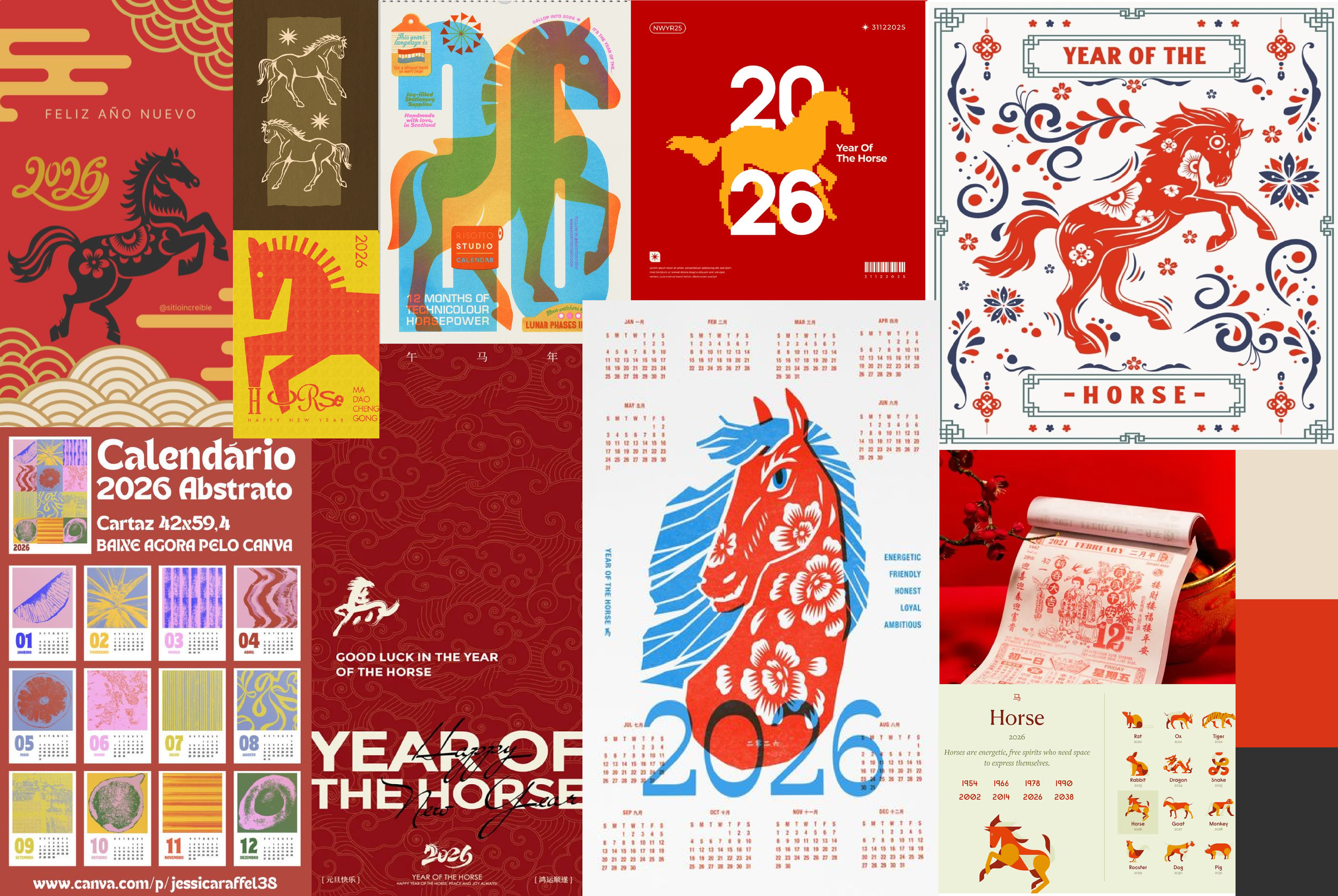
While curating this mood board I found a lot of colors and patterns to take inspiration from. I began to research the history behind the Chinese New Year and the meaning of the fire horse. The year of the fire horse symbolizes passion, vibrancy, and visibility; because of this meaning I knew the kind of color palette I wanted to use.
MOODBOARD
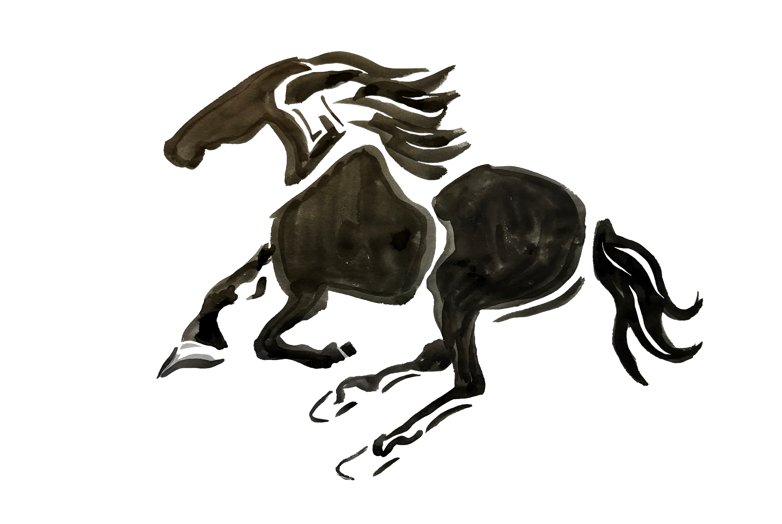
I began to watch videos on Chinese Ink Wash Painting, a traditional form of Chinese calligraphy. I practiced for a few days until I finally got the kind of painting I was hoping for. I then took this illustration and placed it into Photoshop where I began to mess around with the colors.
Illustration
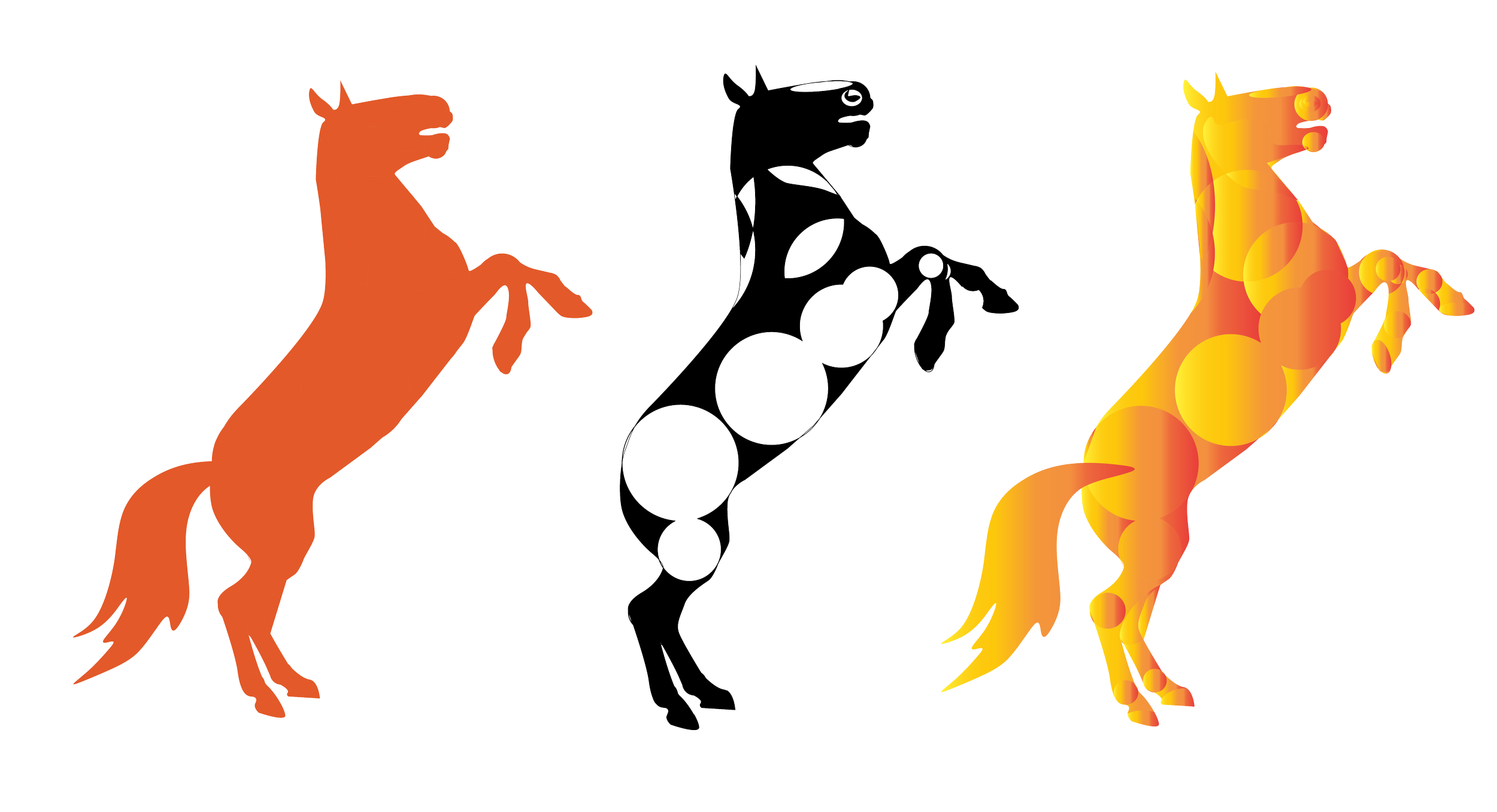
I also wanted to explore some more structured illustrations for this project. I started by outlining the overall shape of the horse body, and then proceeded to block out main curves and shapes with circles. Circles symbolize the cycle of the lunar new year and hold a lot of meaning in Chinese culture. Using the shape builder tool in Illustrator I messed around with the lines, curves, and gradients. I decided I liked the hand painted feel of the ink drawn horse more than the structured ones.
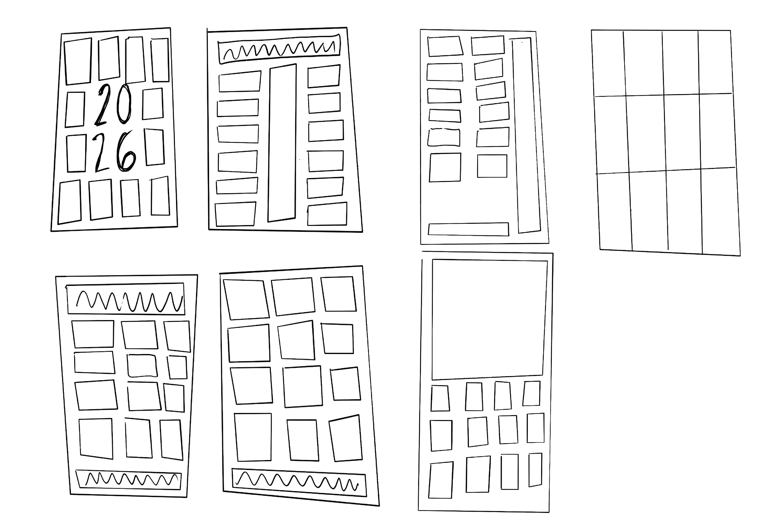
When it comes to designing a calendar one of the most important aspects is the layout. I needed to ensure that I was going to be able to fit all of the months and days while also taking readability into account. I knew I wanted to do a vertical layout due to my mood board consisting of a lot of vertical examples. I then looked at what version would allow me to include my illustrations while also keeping the months easy to read.
layout
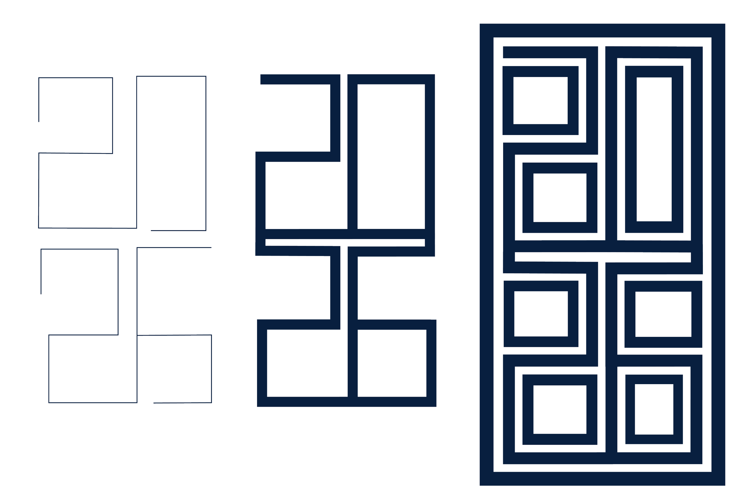
A lot of references I had looked had had interesting patterns placed behind or on the sides of the prints. I decided I wanted to create my own “pattern” that would be used in the illustration while also representing the year. Since the horse illustration was hand painted I decided I wanted the emblem to be more structured. I started by using the pen tool and began to block out the numbers 2026. From these I began to refine the shapes, using right angles and symmetry.
emblem
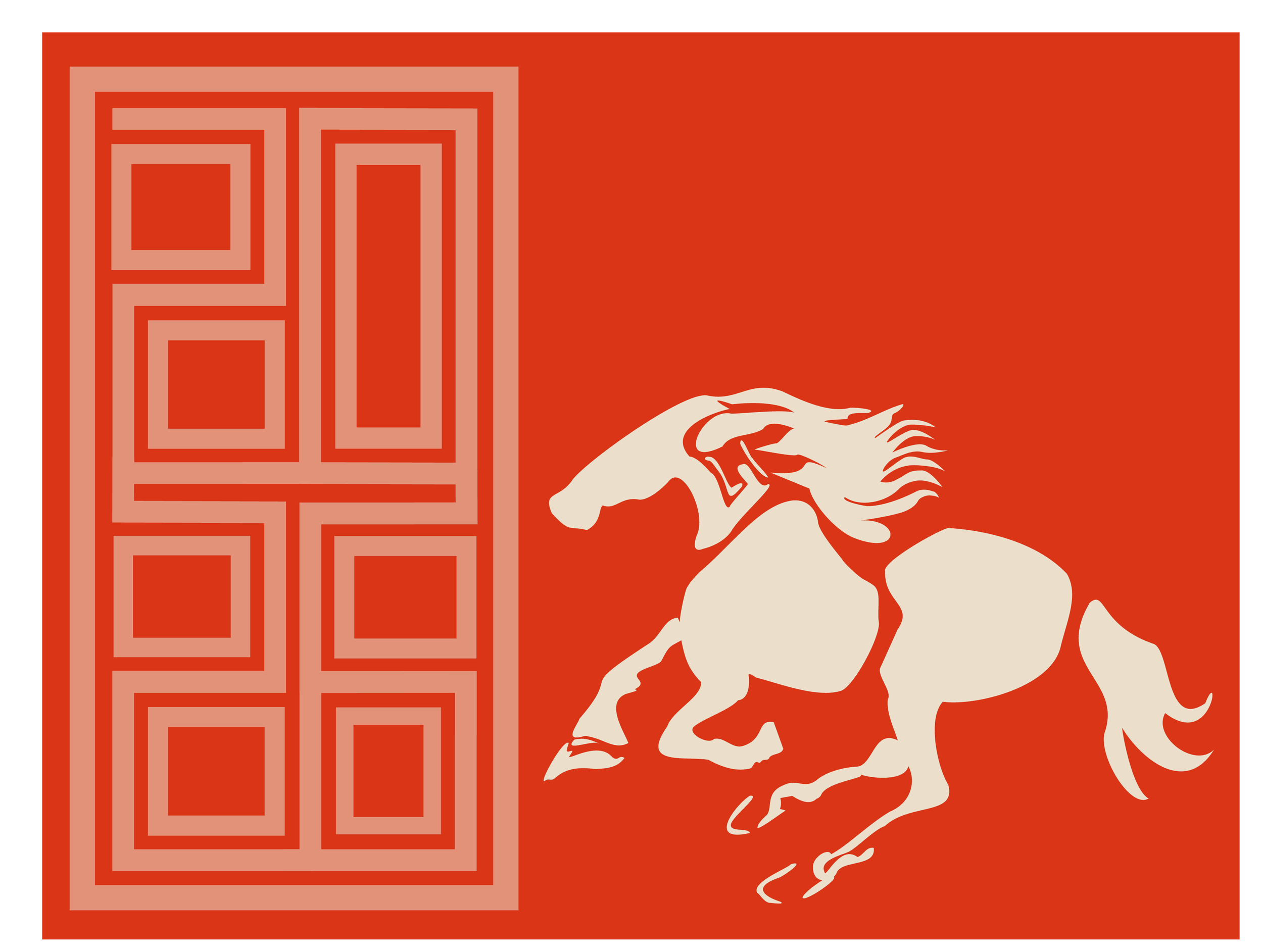
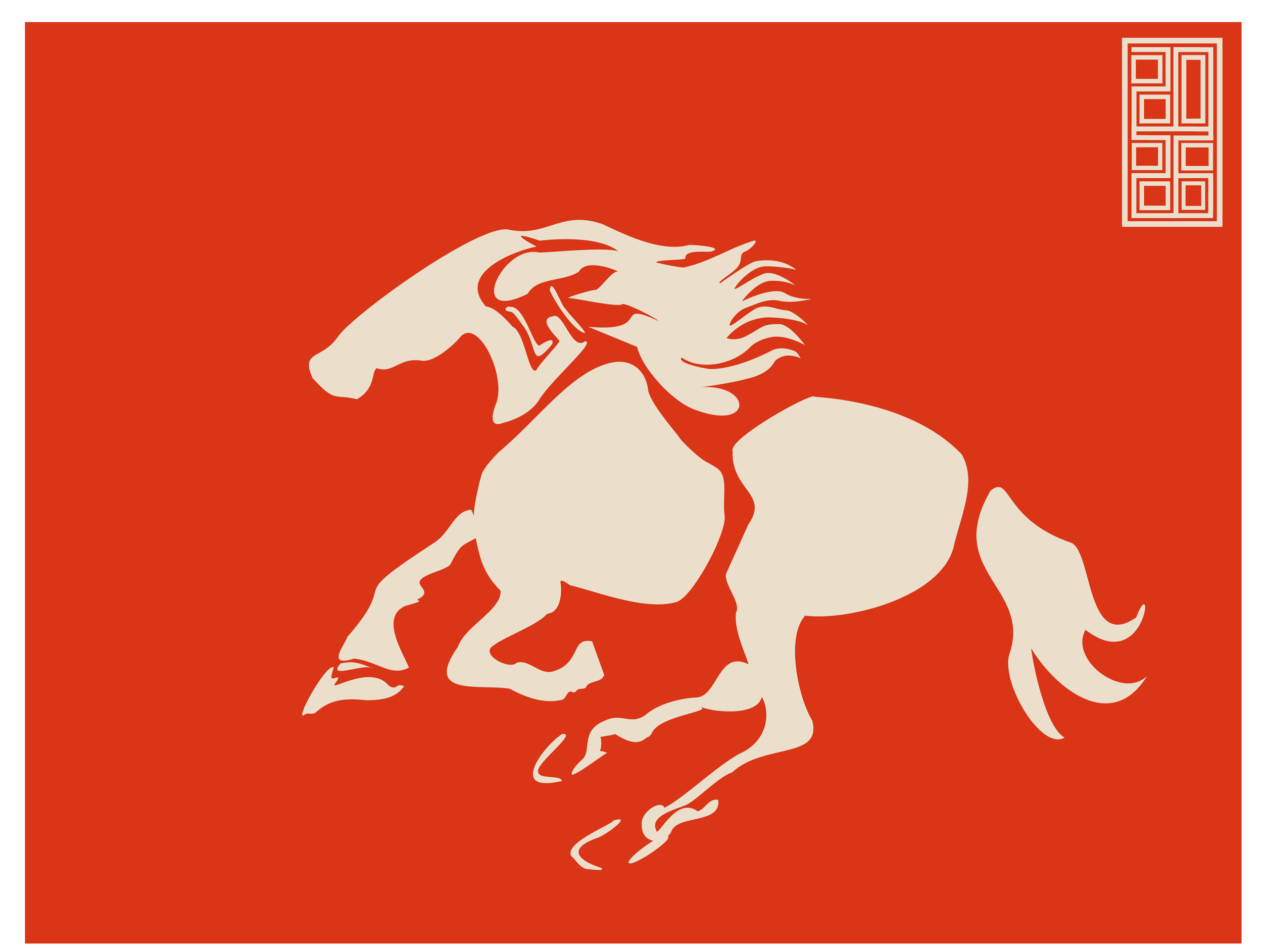

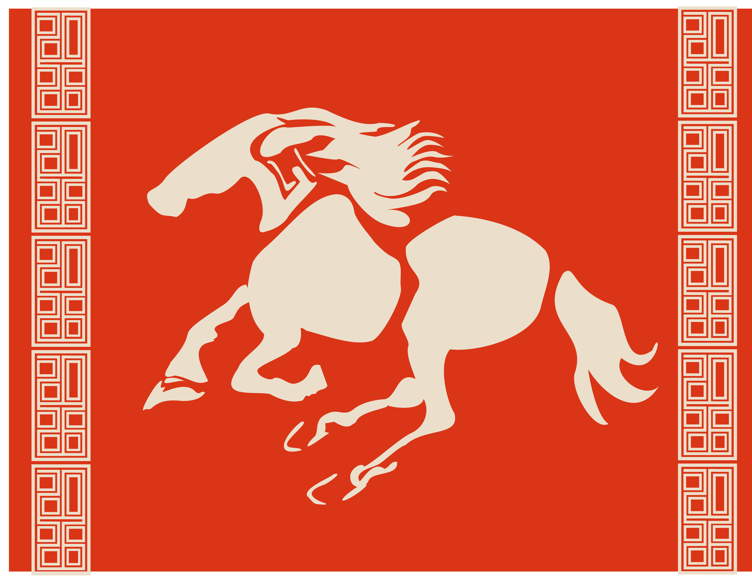
While exploring the different layouts for my illustrations I looked at patterns, gradients, and sizing. I wanted to keep the horse the focal point while also showcasing the emblem. I also messed around with using the emblem as a larger pattern when combined.
Iterations
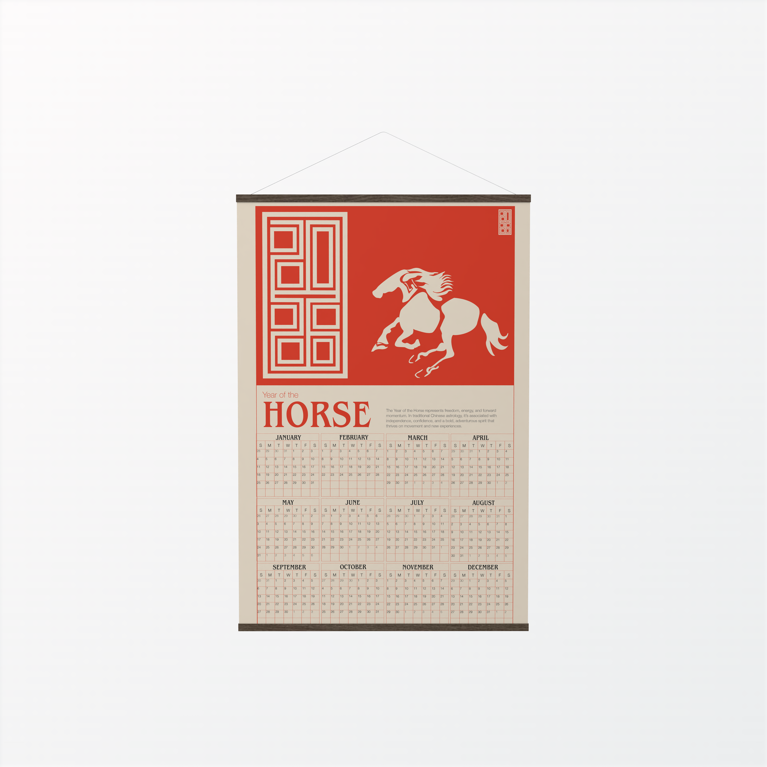
For the final design I used the traditional bright red color that is seen in a lot of traditional lunar new year designs. I included a little blurb of what the year of the horse symbolizes. The structure of the months and dates are clear and concise to help maximize readability.