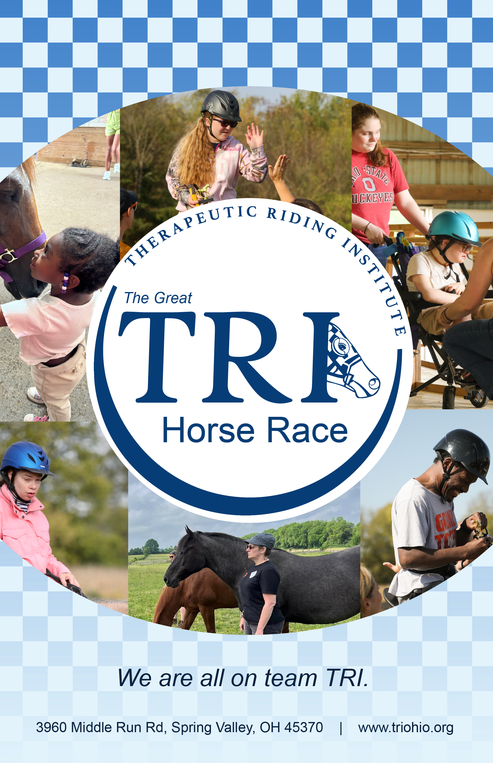
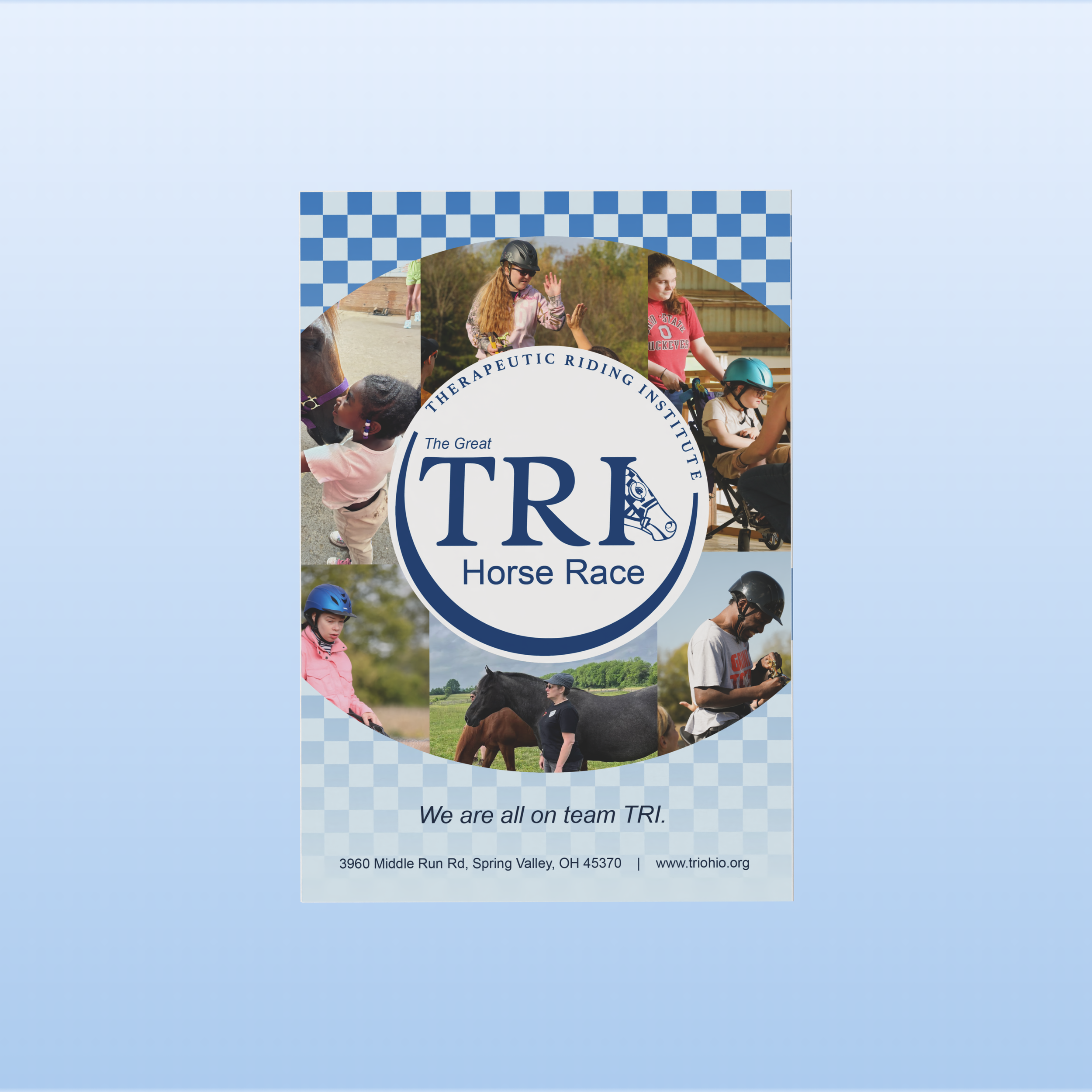
The Great TRI Horse Race
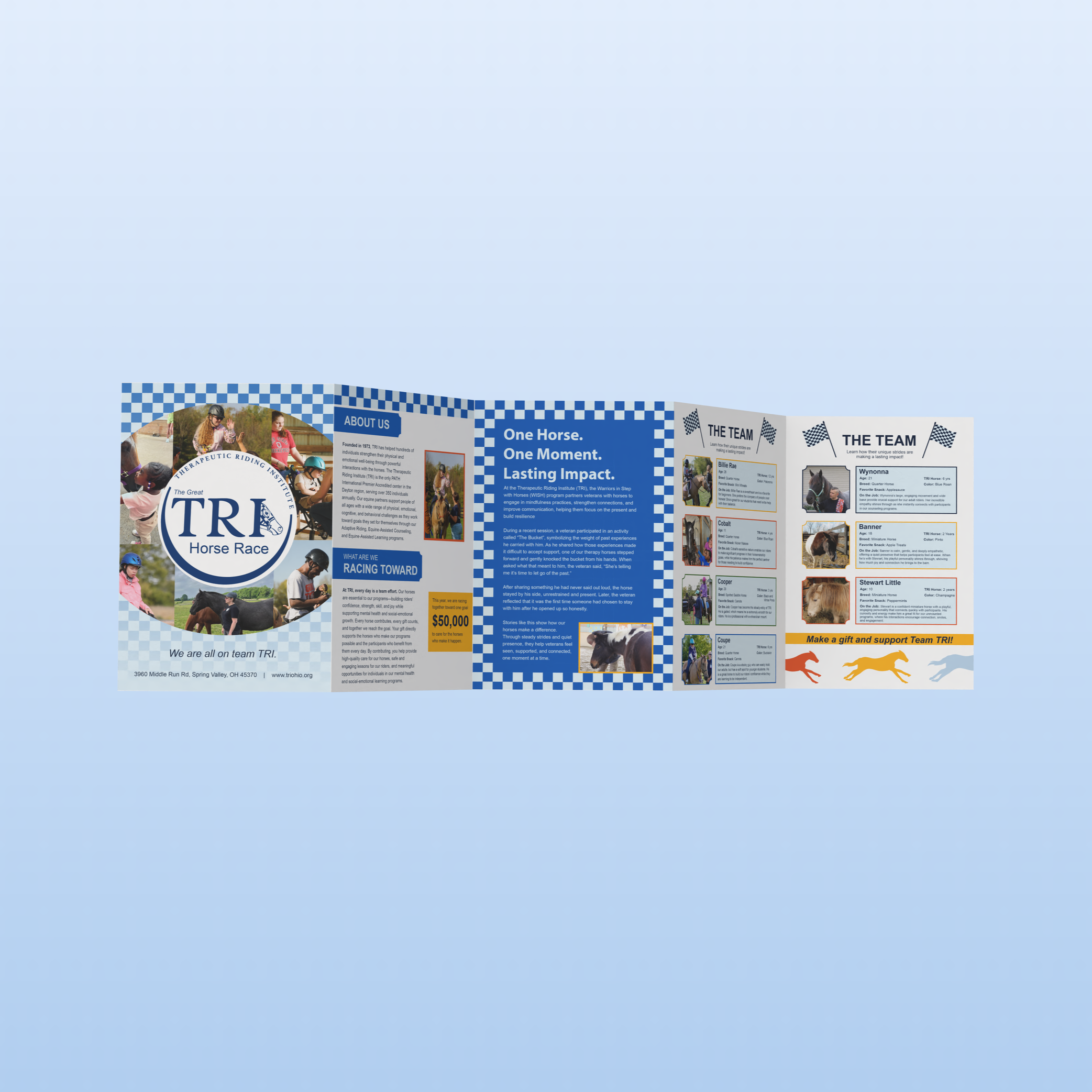
During my time working with the Therapeutic Riding Institute (TRI), I contributed to an organization that is the only PATH International Premier Accredited center in the Dayton region, serving around 250 individuals each year. Since 1973, TRI’s equine partners have helped people of all ages—from 5 to 80—overcome physical, emotional, cognitive, and behavioral challenges and achieve goals they once thought impossible. Serving communities across Southwest Ohio, TRI offers therapeutic riding, equine-assisted counseling, and learning programs that support a wide range of diagnoses, including autism, cerebral palsy, Down syndrome, and mental health needs, while fostering meaningful social and emotional growth.
The Great TRI Horse Race is an annual digital fundraising event to raise $50,000 for the Therapeutic Riding Institute. I was in charge of creating a new brand identity for the campaign, creating the mailer, and social media campaign.
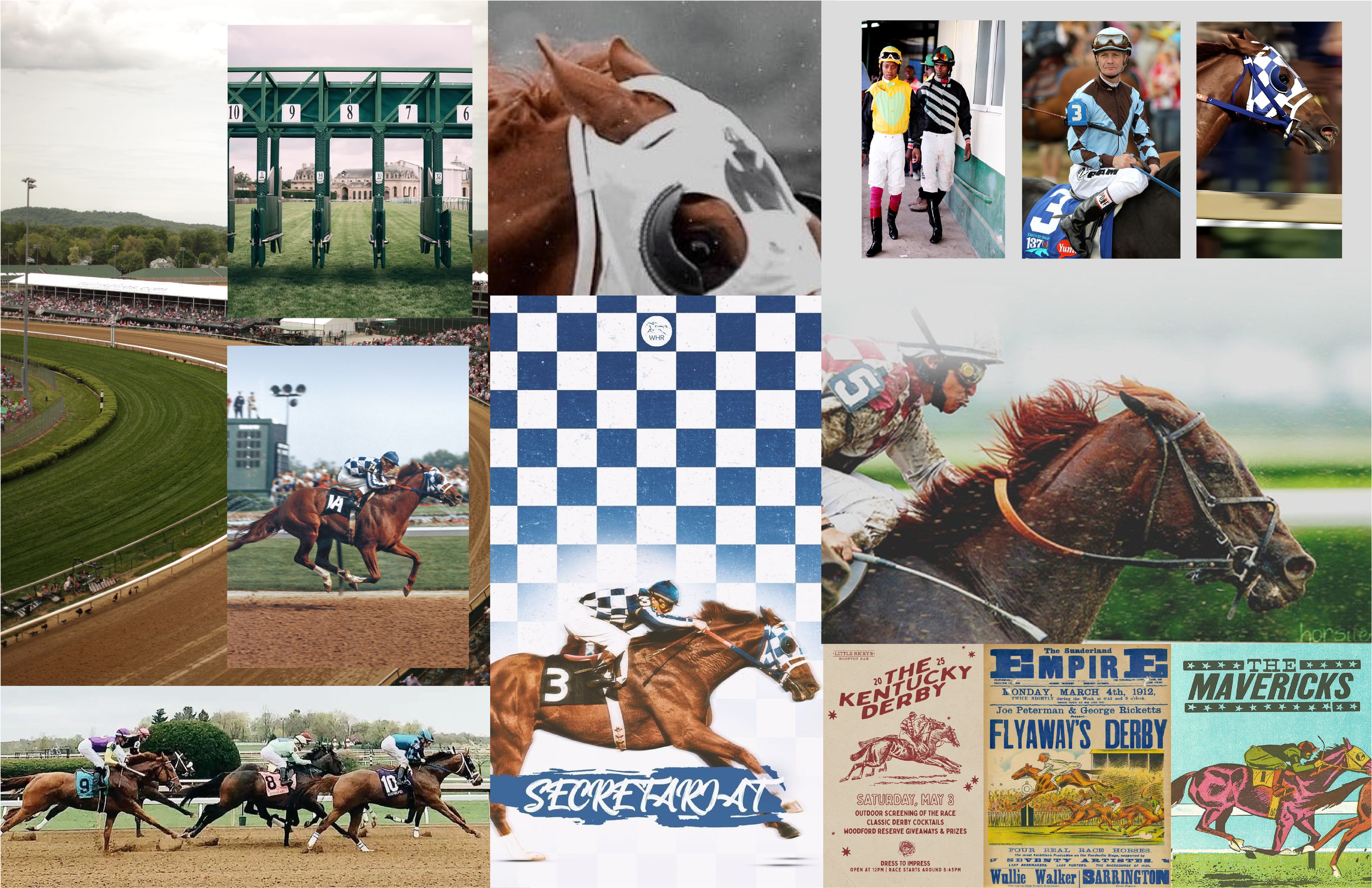
While creating the mood board for this campaign I was interested in the classic derby style. While TRI’s branding consists of bright and bold colors, I wanted to make sure we incorporated the “secretariat” style.
I also wanted to take some inspiration from the colorful jockey outfits and their patterns. These are a classic when it comes to racing.
MOODBOARD
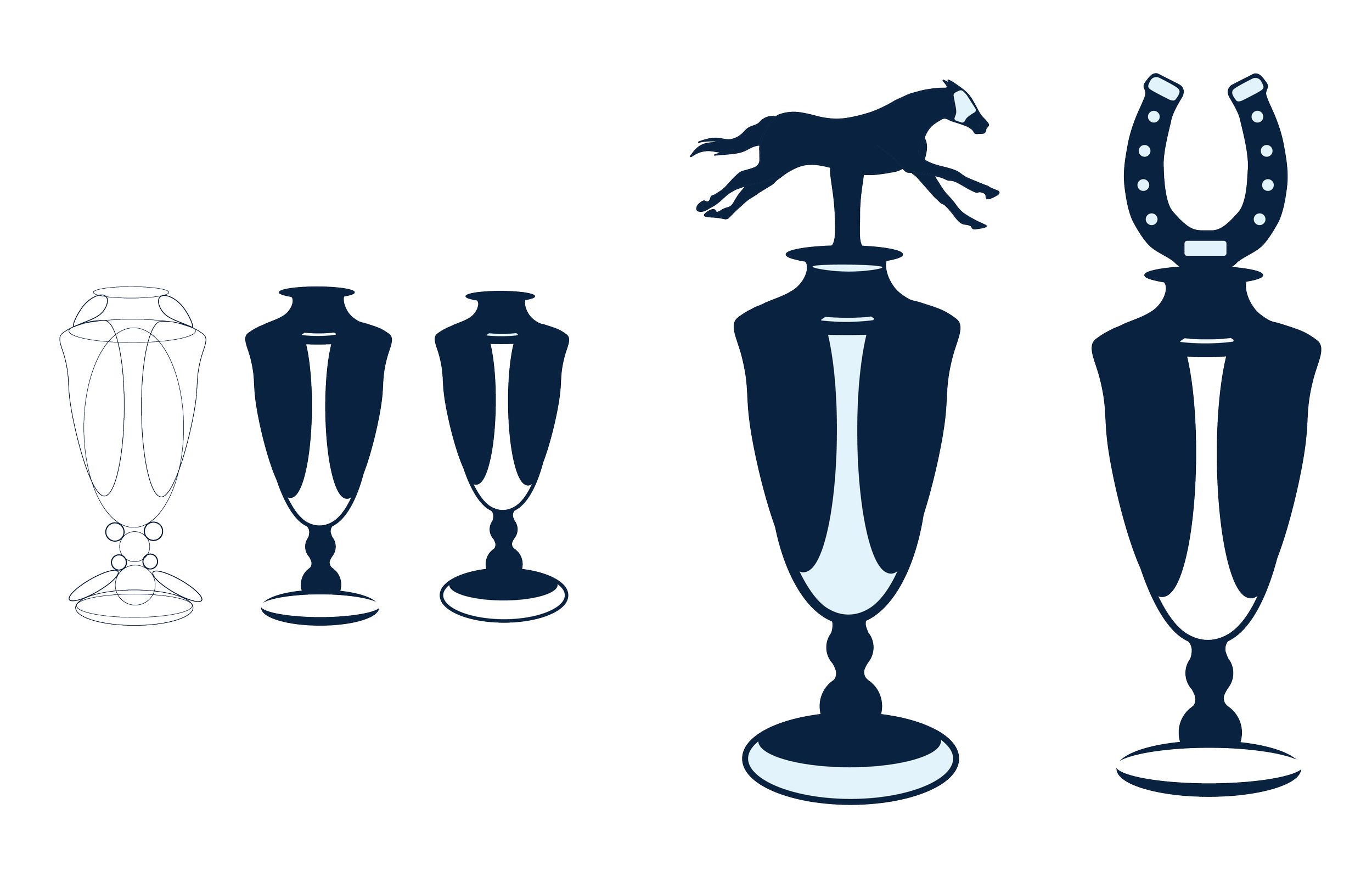
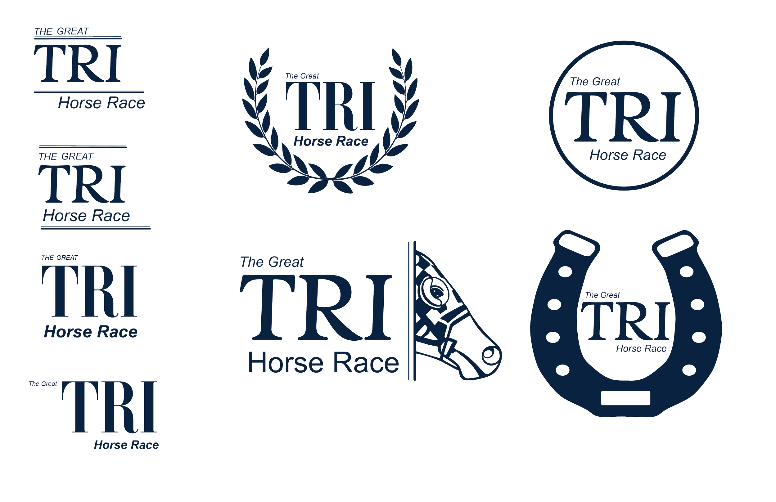
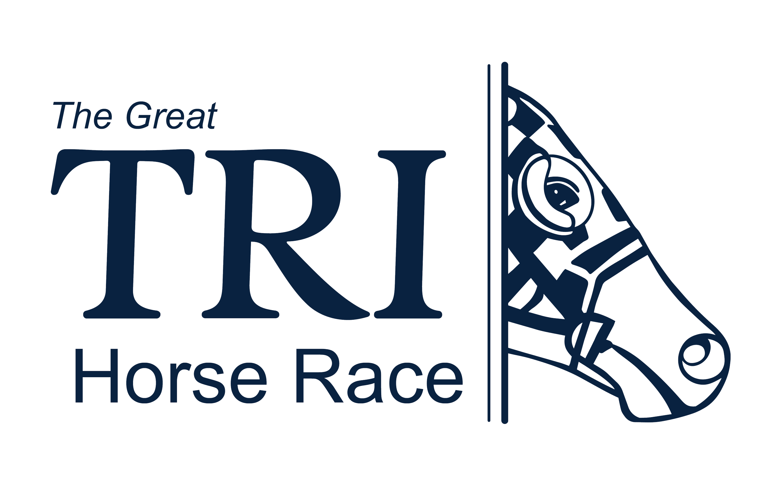
While exploring different options for the new logo and wordmark I knew I needed to keep the same typefaces used in TRI’s brand identity and the colors. I also knew the that wordmark itself was going to need to go into a circle to match the other logos used with the brand.
For the final I decided to structure the type on top of one another. This was for practical and visual reasons, with limited space on the mailer itself I knew I would need to condense the type.
The logo is inspired by a horse taking off out of the starting gate. I made sure to incorporate “blinders” onto the horse in the logo. Blinders help a horse see straight forward and keep them focused on the goal ahead, for TRI that goal is raising $50,000.
Logo & Wordmark
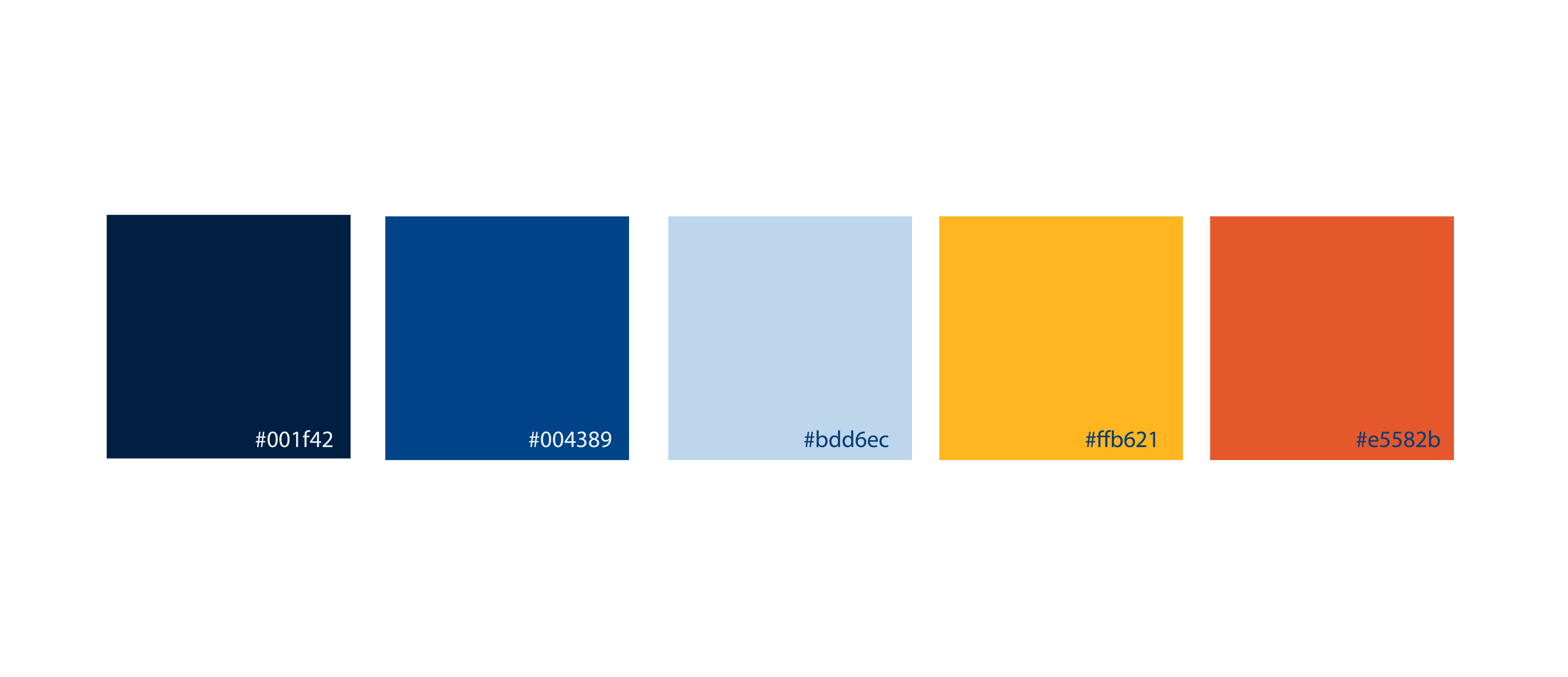
I used the main colors of TRI’s brand identity for this project to make the campaign easy to recognize that it is a part of TRI. I decided to use the blues as a focal point to tie in the “secretariat style” with the yellow and oranges as the callout colors.
colors
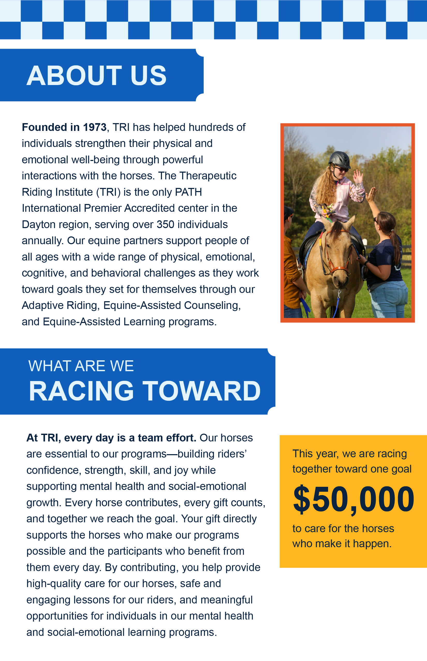
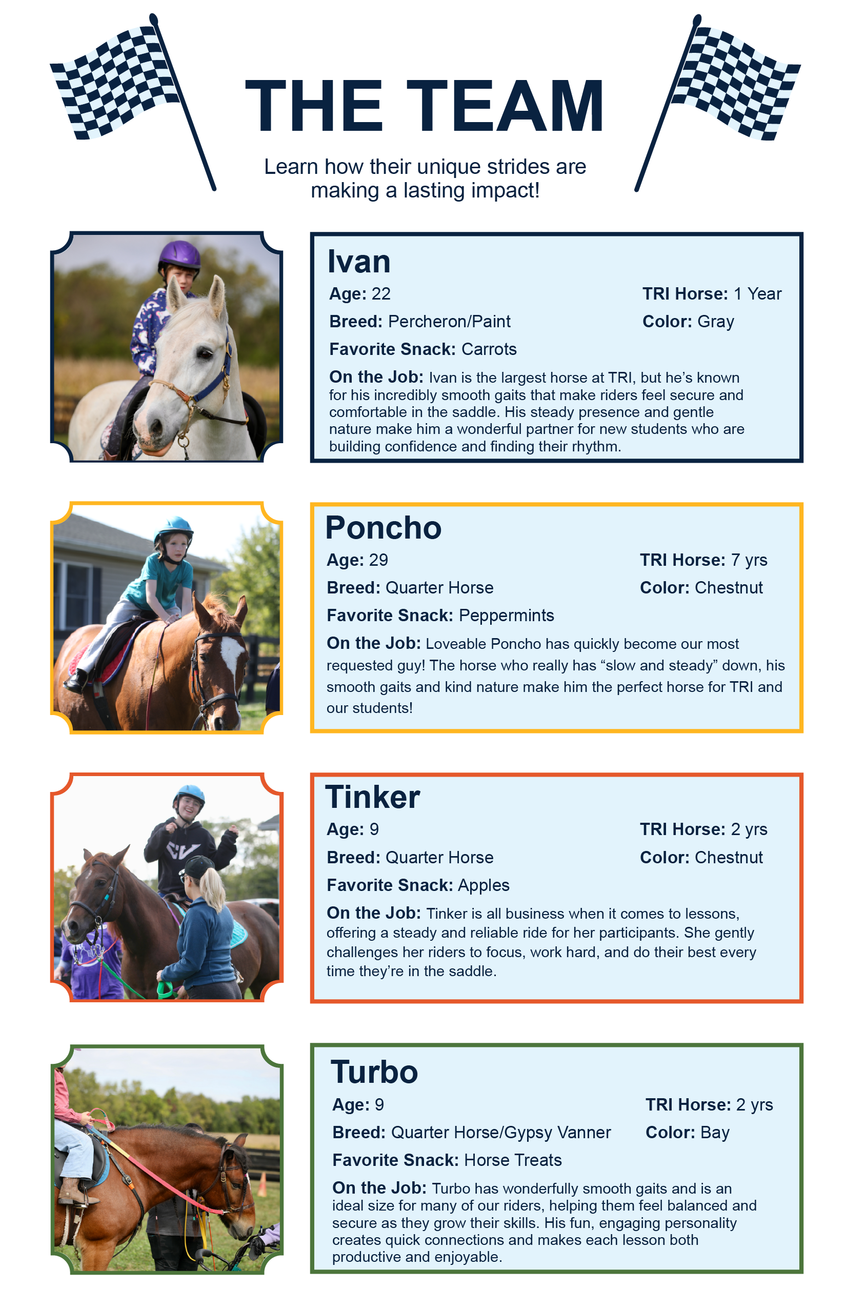
The final layout walks you through who TRI is, what the Great TRI Horse Race is, why and how to donate, an interview, get to know the horses, and other ways to help TRI. This sequence of content was incredibly important when creating the mailer. We wanted to take the user through a journey.
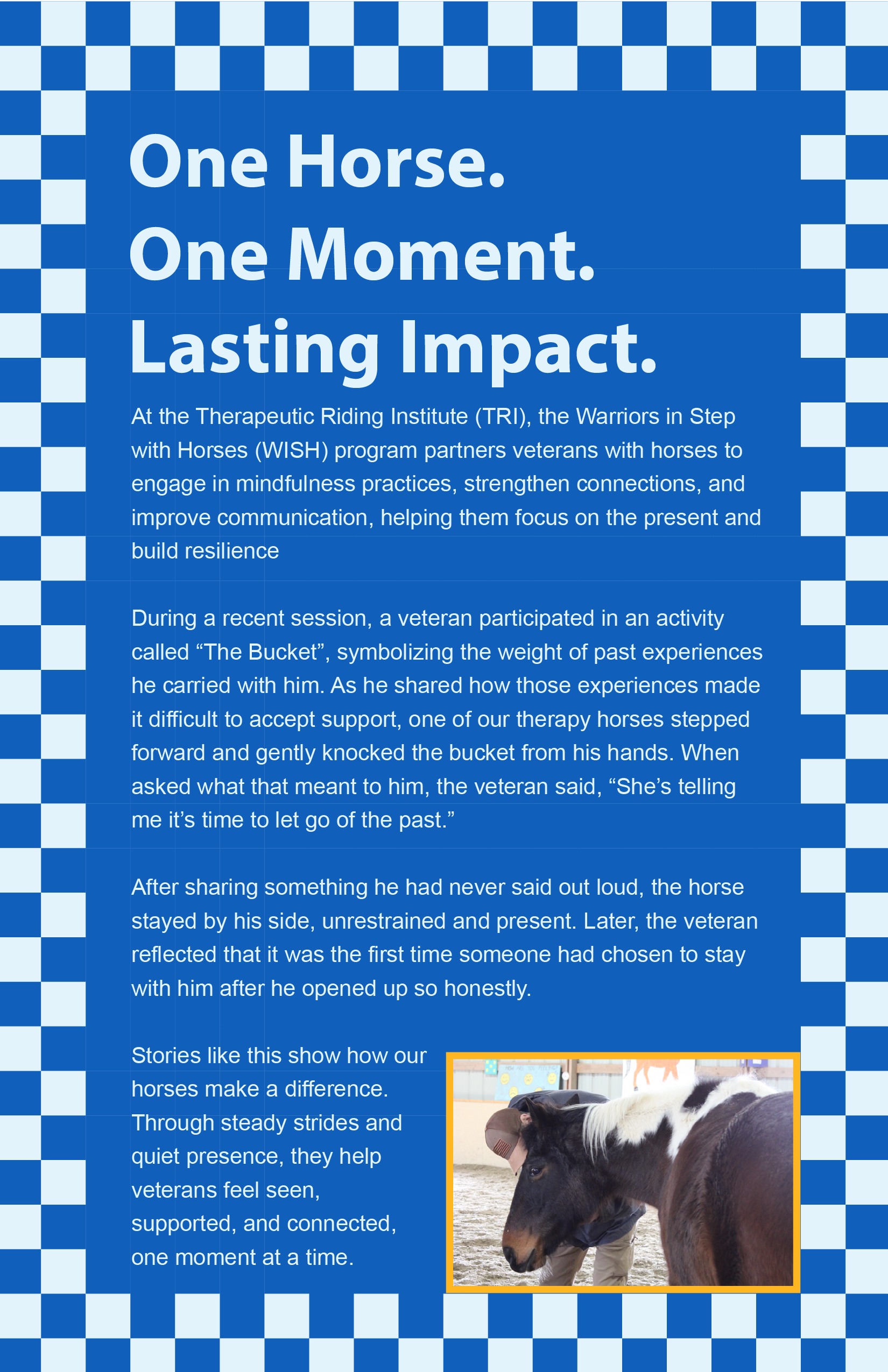
I also wrote the interview section of this mailer. I had the opportunity to interview a participant of the WISH program as well as other students. These other interviews were used in our social media campaign for the horse race.