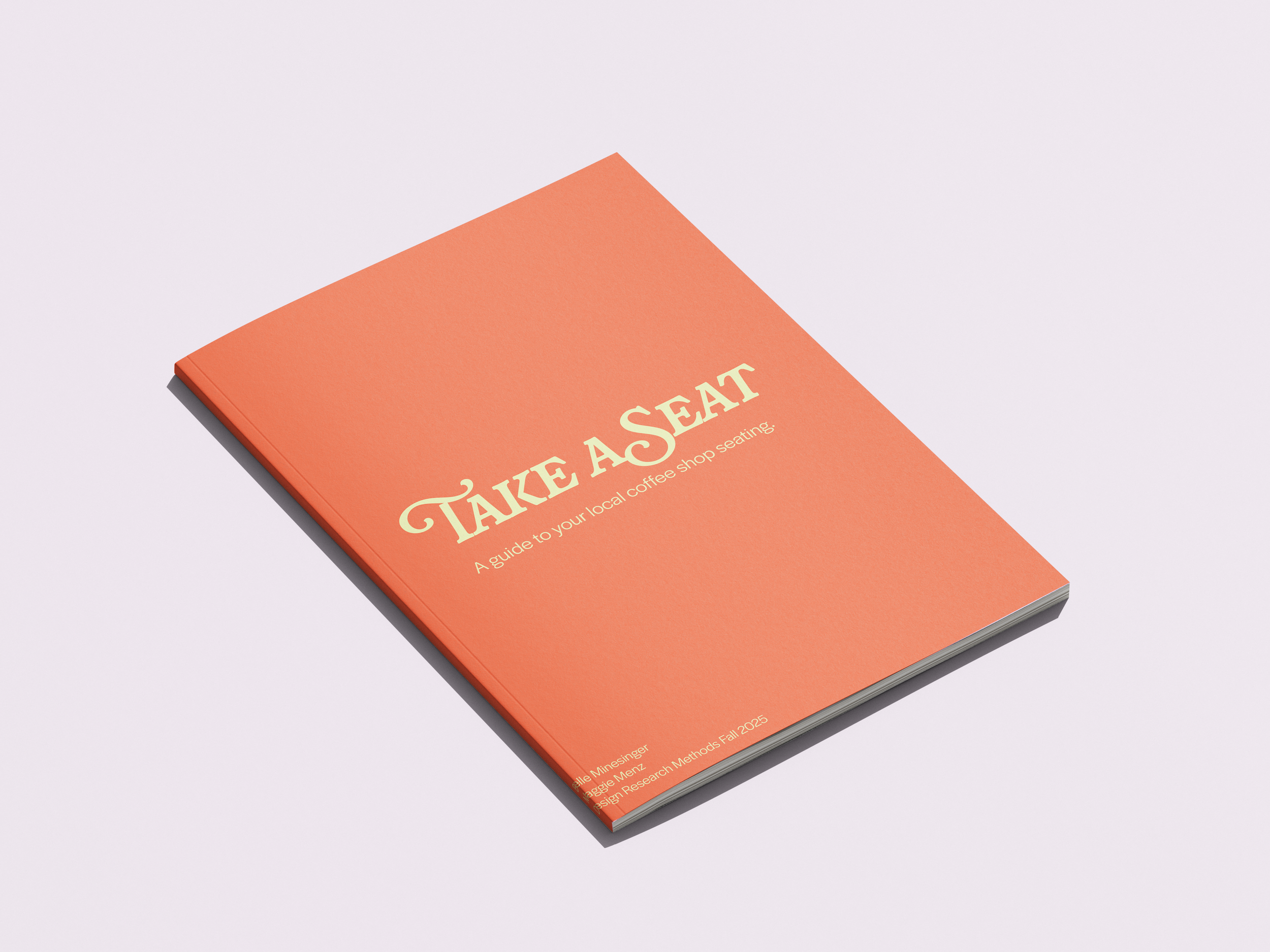
TAKE A SEAT
TAKE A SEAT is a print booklet that explores coffee shop seating in a 3 mile radius around University of Cincinnati campus. Upon narrowing our projects scope we found that a lot of students can have different study sessions and experiences due to the seating available. We decided to log every seat at these corresponding coffee shops.

BRANDING
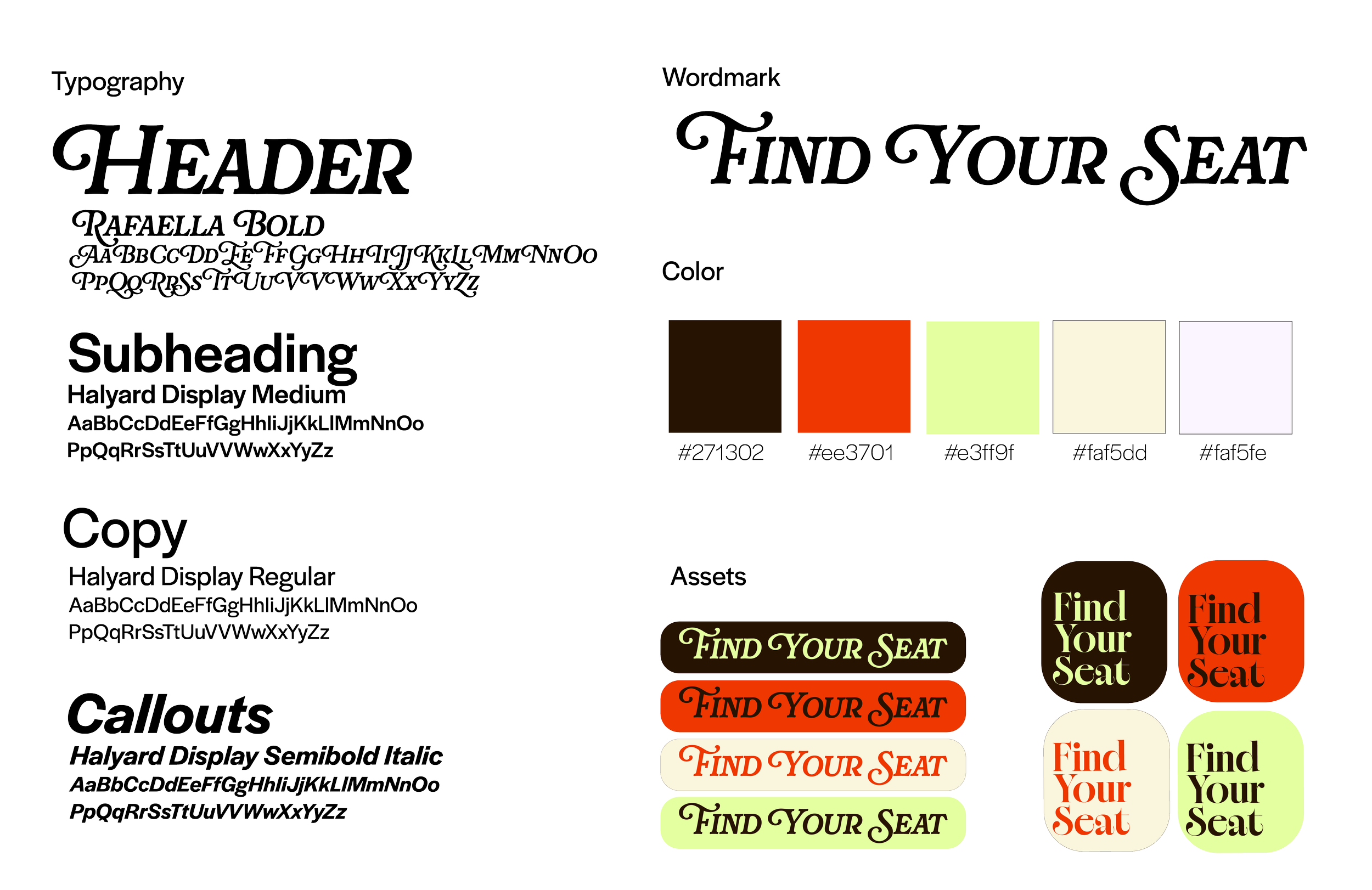
The branding for this project was a blast. We wanted to incorporate that “coffee feel” while also keeping an interesting color palette. Each color contrasts the other and allows for a cohesive and collaborative feel.
We decided to use Rafaella Bold for the word mark typeface. We loved the structured feel behind the letters while also incorporating some curves. This reflects the structure of. lot of the chairs we documented.
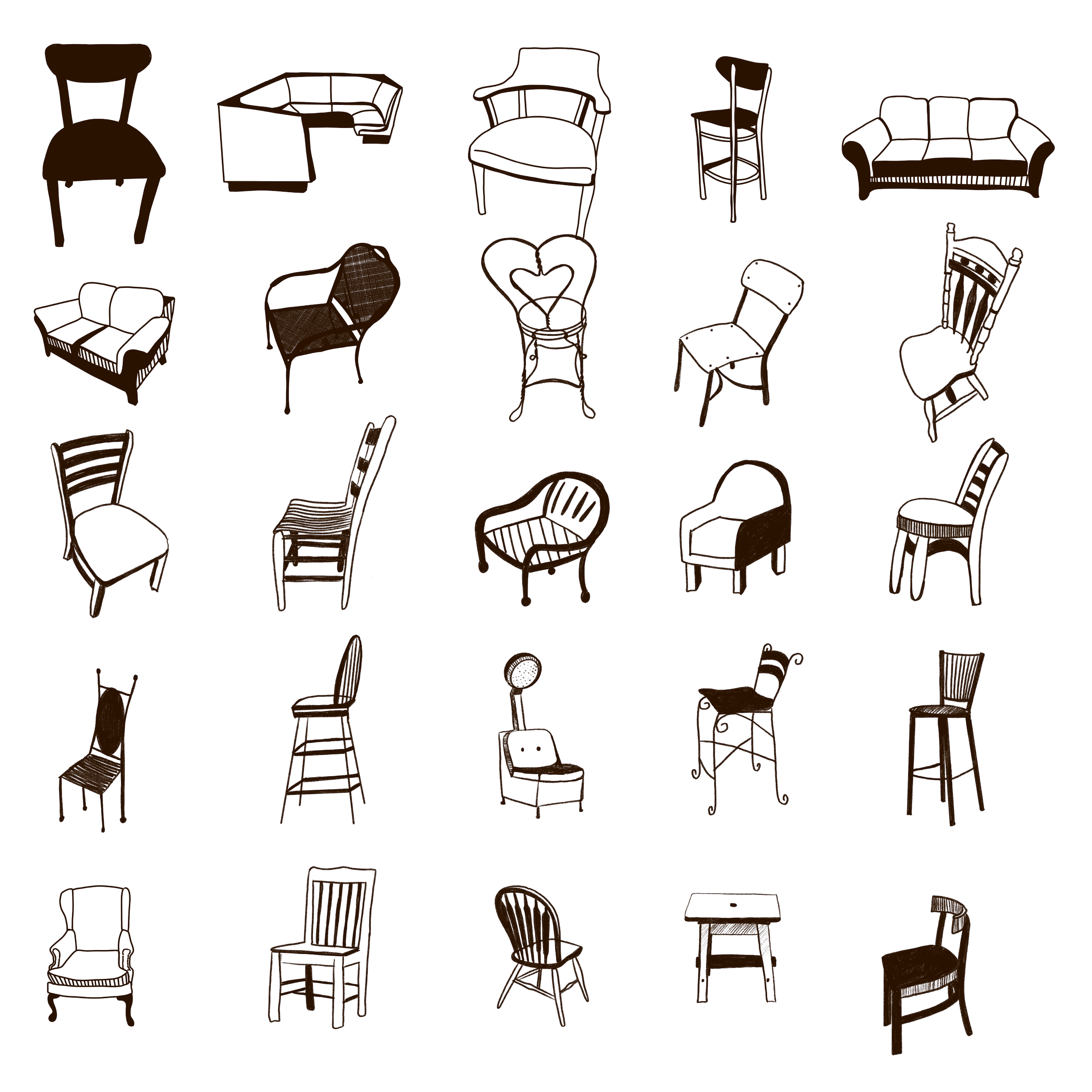
chair Documentation
We decided to limit the radius/coffee shops that we would be documenting due to scheduling. We landed on a 3 mile radius around UC, this was also the most frequented coffee shops amongst students.
We went to each shop, ordered some coffee, interviewed the baristas and workers, and of course took photos of the environment and the seating. We also made sure to document the number of those specific chairs there were.
Chair illustration
I used the platform ProCreate to sketch the chairs. I made sure to mimic the angles and structure of the chairs to ensure proper documentation.
Once the chairs were sketched in ProCreate I transferred the files into Illustrator where I made them into objects.
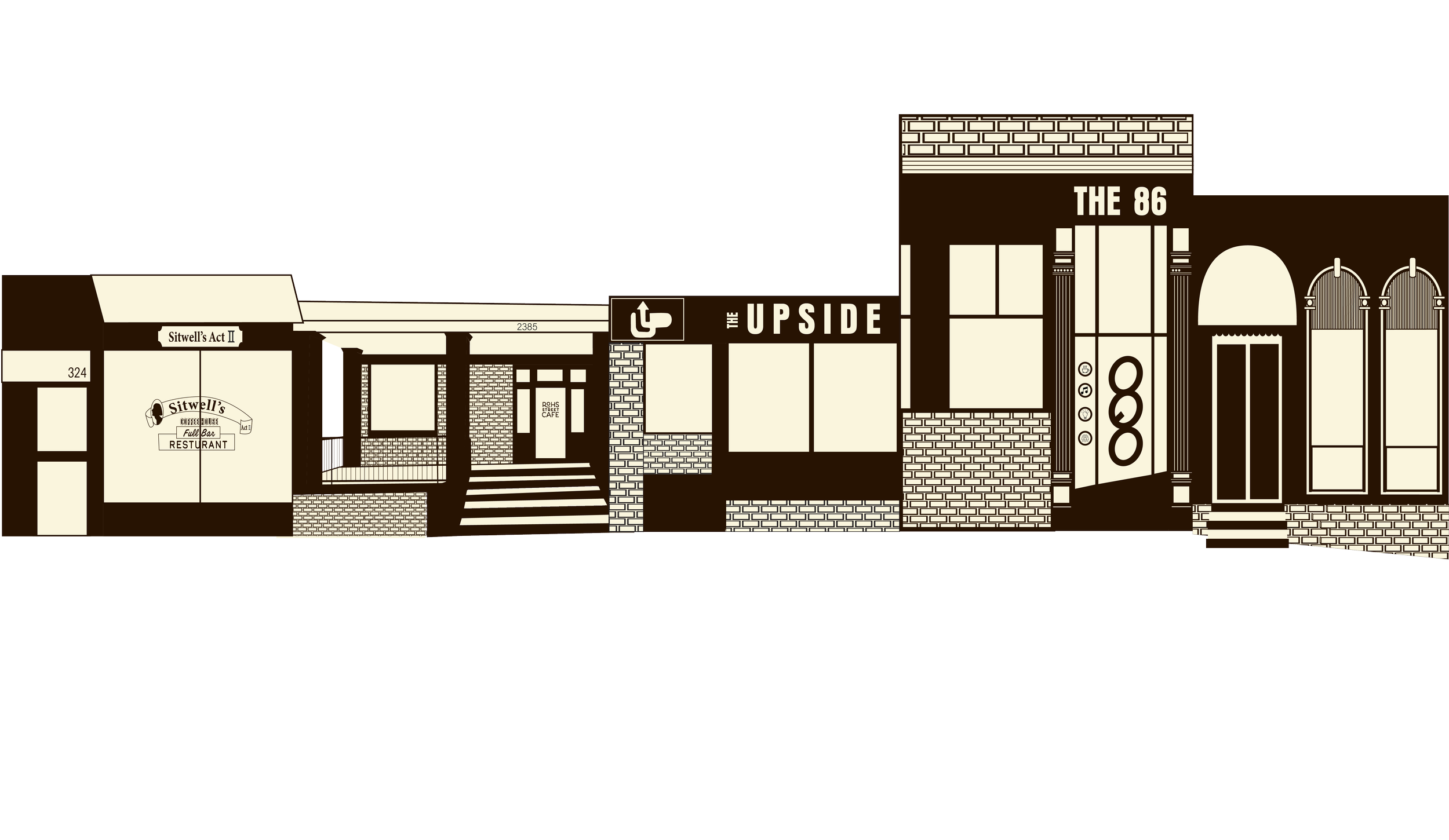
Shop illustration
When illustrating the fronts of the coffee shops I made sure to use the same elements to ensure a cohesive look and feel amongst the shops.
I identified the most important/prominent parts of the shop fronts and made sure that they were illustrated in a manner that they would be recognized easily.
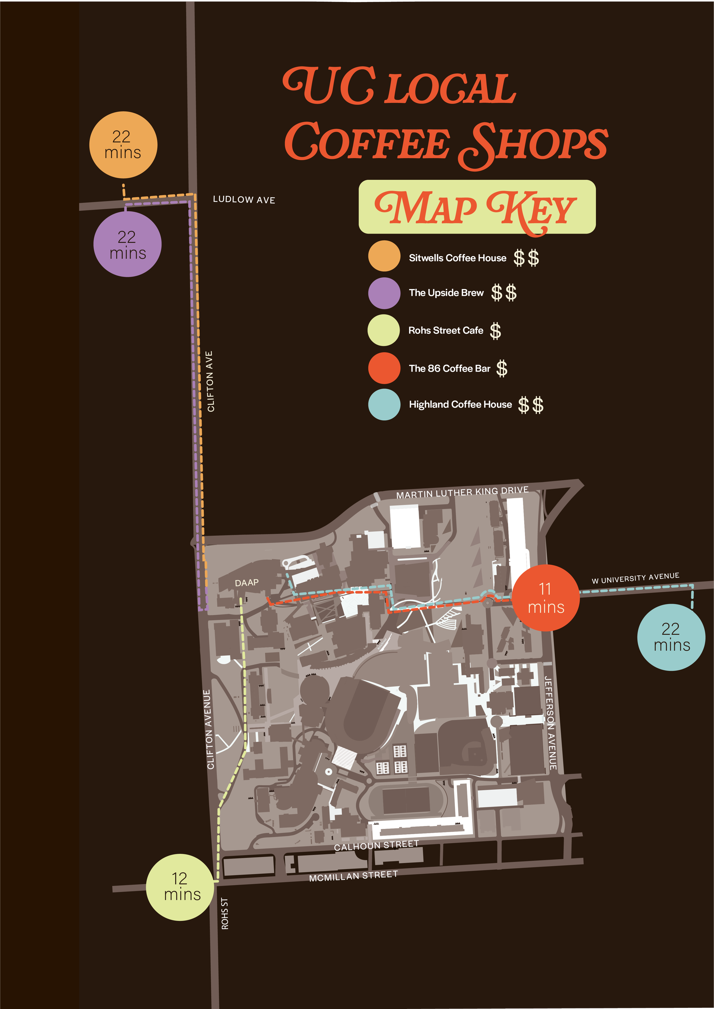
Map illustration
When designing the map we went ahead and found a map of UC campus, re illustrated it, and used it as the foundation of our map. We wanted to make sure that students could easily navigate from their classes to these shops.
Under the Map key you will see that we incorporated dollar signs. These indicate the price range of the coffee and food at the shops.
We also incorporated the time it takes to walk from DAAP to the shop itself. While this booklet is for all students, it is made for DAAP students.
These locations are also color coded to match the color coded coffee shops on the inside of the book.
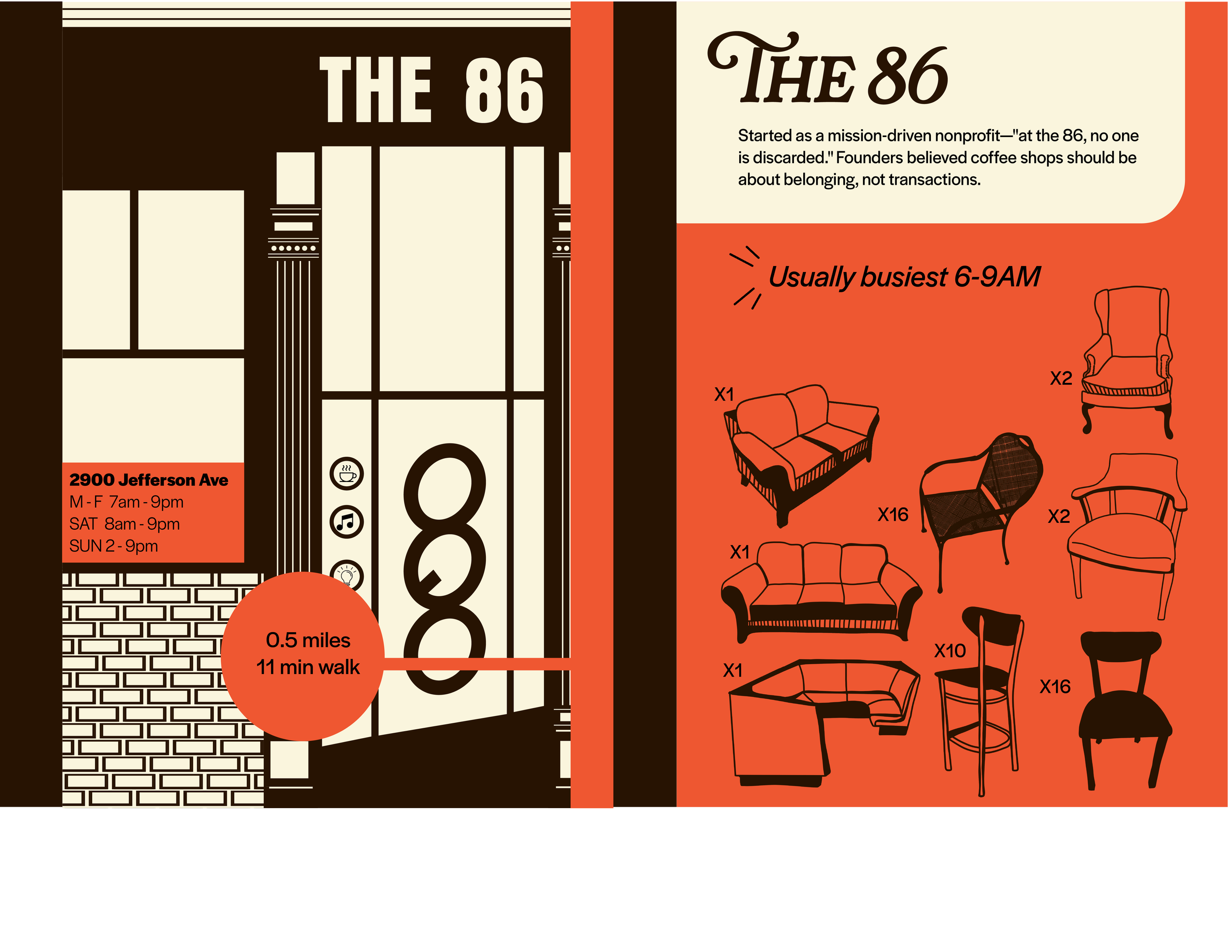
The pages
Each coffee shop page is color coded, has the hours of operation, distance and time to walk, when they are the busiest, a small blurb about the shop, and of course the illustrations of the seats with the corresponding amount.
We wanted to make sure that we had essential information that a student might need in order to decide what shop to go to. We also wanted to make sure that we weren’t taking away the total element of surprise. Part of the experience when visiting a new coffee shop is exploring the new environement.